Sonia Browder: The Five Question Interview

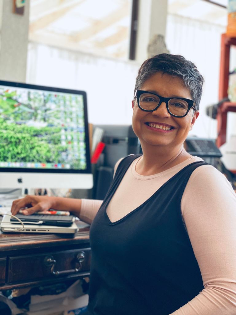
Sonia Browder is a photographer, designer, and owner of Lordnidesign. She is a busy portrait photographer and loves taking photos of Elgin.

1. Why did you move to Elgin? 

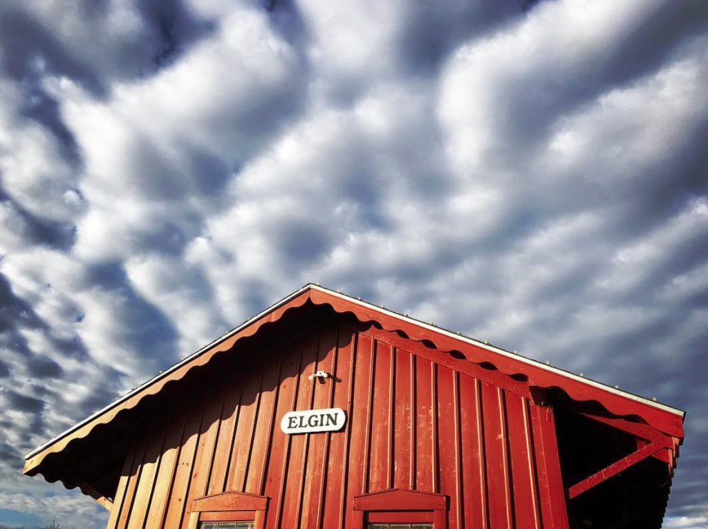
Paul and I were living in south Austin when we started looking for a home in the country. We wanted land big enough to settle a couple of families—ours and my sister and hers. We found enough acres to raise our kids in the country just outside of Elgin. Soon after, my parents and brother with his family moved out here, too. It’s our retreat!

2. What compels you to spend time creating?

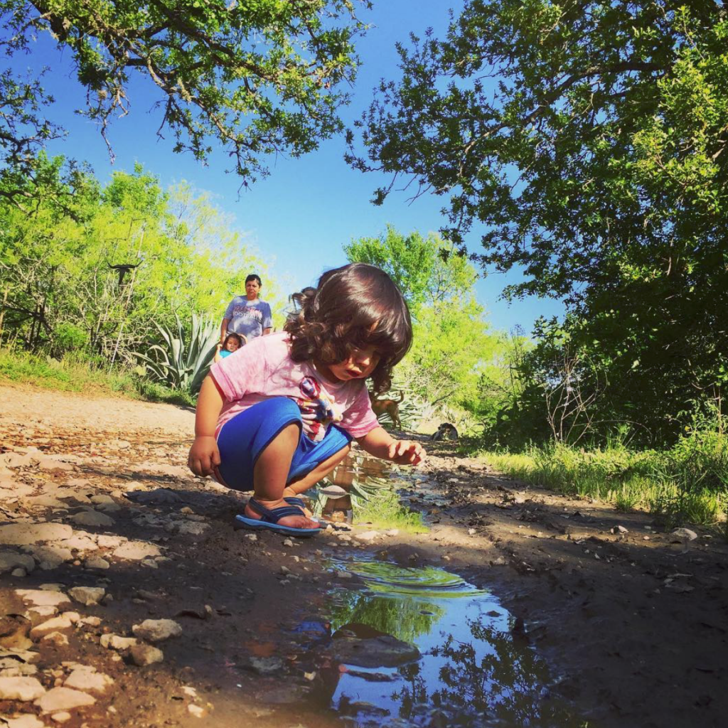
I’ve always enjoyed making and creating. I’m sure I picked up this idea that I could from my mom and her ability to make and create. When I was growing up, we didn’t have much money for extras but we still never did without. If we saw something we liked to wear, my mom would sew it, crochet it or knit it —for us AND for our dolls! It’s always been good therapy for me to create something—it’s a good feeling to make a family portrait, a plate of enchiladas, a hand-lettered sign for a friend, or a T-shirt for a much loved small town festival! It’s art to share!

3. Tell me three things you’ve learned in the past five years.

1. Gardening: Water regularly.

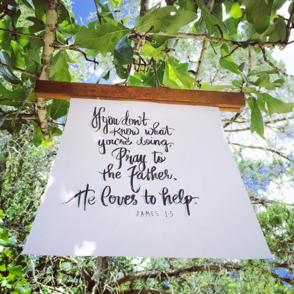
2. Jesus went INTO the fire with  Meshach, Shadrach and Abednego (Daniel 6.) We need to invite Him into our tough situations. It’s better to go through life with Him than without Him.

3. Spanish was my first language, but when I don’t use it, I lose it! Im glad for the many opportunities I’ve had in recent years to speak more Spanish. The practice has helped me. I am able to translate and communicate in Spanish more and

4. What are you currently making, reading, watching, or listening to?

Making:  I just finished working on the Western Days 2020 Commemorative T-shirt. The printed shirt just delivered. I am also working on a couple of logos; one for Evergreen Farms and another for Nanny Goat Salsa and have an engagement photo session planned for the weekend.

Reading/Listening to: Redeeming Love by Francine Rivers

Watching: Just started watching Outlander—I’ve got a very long way to go!

5. Cake or Pie?

Pie —coconut cream, cherry, pecan & millionaire pies for starters!

Instagram @lordnidesign
Facebook @lordnidesign
Website enyecreative.com

Love it or Hate it?

Last Summer after setting up a She Creates Union Pop-up at Yarnorama, Emma clasped her hands together and exclaimed, “Now’s the perfect time for some Marmite!” I can honestly say that’s a sentence I’d hear before and am likely to never hear again, for that matter.

I had a taste of hers, and while I kinda liked it, it wasn’t until I saw it on the shelves at a store that I decided to grab a jar and try it for myself.

Since March I have been eating this sticky, dark brown spread on buttered toast on the regular. I’ve recently expanded my repertoire to include toast with Marmite and cheese. Fancy, I know.

Not sure why I have all of a sudden I have a taste for it, but there you are.

The packaging is so great, and it’s marketing campaign even better. “you either love it or hate it.”

PS. Speaking of spreads, try this Tex-Mex twist on a classic.

Weather’s Beautiful, Wish You Were Here!

I have a small but growing collection of vintage souvenir postcard folders. Some have never been used, but I actually prefer the ones that have been addressed and stamped. It’s somehow sweeter to know they were sent to a loved one.

At first it was the kitschy Americana that originally drew me to them. But it’s the overly saturated coloring that makes each of these feel special, like tiny paintings.

Warning: Print Geek Alert

Color photography was not as advanced as printing techniques for the first half of the twentieth century. Black and white photographs required coloring in the printing process. New colorants, more like dyes than inks, were being experimented with in the late 1920’s. Their watery quality meant they absorbed into the paper too quickly and were slow to dry… making images blurry,

Printer Curt Teich & Co in Chicago, discovered that embossing the paper with a linen texture before printing created more surface area, and new heat set inks meant faster drying times. This meant that the dyes were set on the linen surface quickly before they had a chance to absorb into the paper. This is what gives these such vibrant colors.

Teich developed a technique called Art-Colortone. This a five-color printing process on a linen-finish stock from a black and white photo. In addition to printing with the usual CYMK colors, a lighter cyan was sometimes used to give the images extra punch. Just look at those skies!

The photograph-based cards also employed handwork by artists who brought them into production. Perhaps it’s this touch of the human hand that makes them feel like tiny paintings to me.