
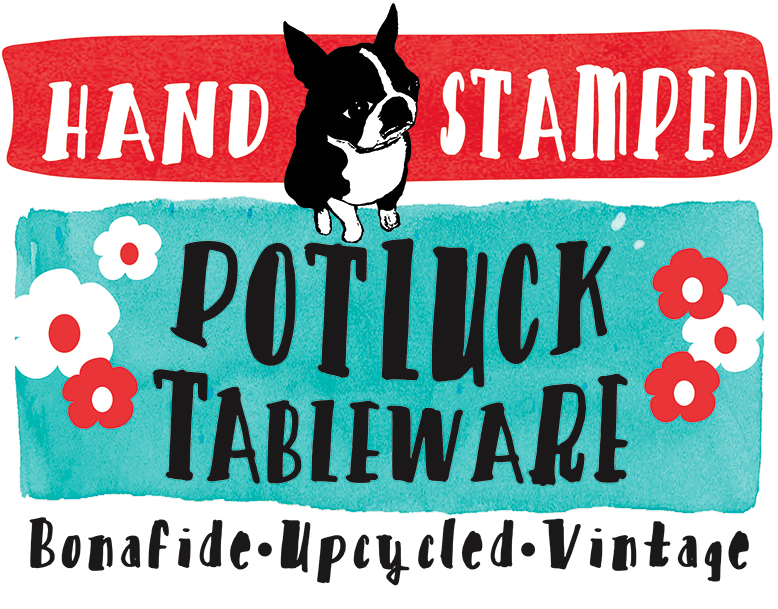
I recently renamed and designed new packaging for my stamped silverware pieces. The new name Potluck, embodies kitcshy, homey, small town, fish fry, church basements and so on. It’s also a nod to the fact that each set is a potluck of patterns, since I never know what I’ll find scouring Ebay and estate sales.
I’ll share a little bit with you about my inspiration for the label art.
The Spring issue of Gravy featured a story of artist Cedric Smith. I was so drawn to his work. I totally fell in love with his use of color and vintage black & white images. They immediately made me think of cake mix box labels and seed packs. I was especially drawn to this piece.

I knew immediately that I wanted to use this as inspiration for my packaging. I decided on a less distressed appearance, but still wanted a much less than perfect finished look. I created a watercolor background for the type to further convey the made by hand quality of my silverware. While I have been trying my hand at hand-drawn type, I decided I needed these sooner than later, so searched for the right hand-drawn typeface. I just love the thick & thin marker look of these.
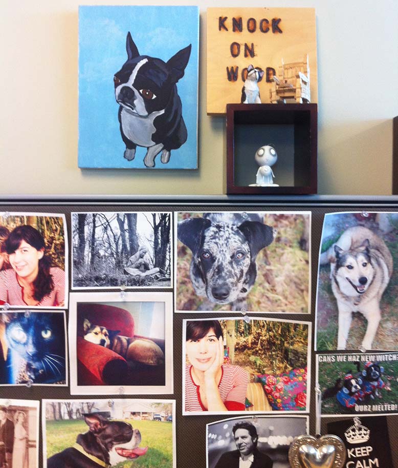
The cute pup is actually from a painting my husband did years ago. It’s always been one of my favorite images. I scanned it and created a poster-like black and white version in Illustrator. I’ve been using it as a profile pic and Gravatar off and on for years. The original hangs on my wall at work. “Hi!”
The flowers were borrowed from one of my favorite dish towels.

Read more about Cedric Smith here. And if you haven’t ever, please do spend a little time to peek around on Southern Foodways Alliance. It’s a wonderful organization.
