
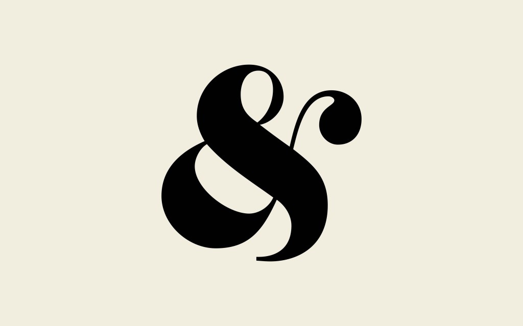
I love ampersands. The curvier the better. The ones that look like an inky roller coaster ride.
Its shape is actually a ligature of lowercase Roman letters e and t (et meaning and in Latin). Ligatures were used by scribes who had the daunting task of writing everything by hand.
The most beautiful ampersands belong to classic typefaces like Caslon, Baskerville and Garamond. I like to use them larger than expected, like the ampersand was planted first and the other letters planted as companions to help keep it company and keep pests away.
Did you know that & used to be part of the English alphabet?
Read more about the beautiful former 27th letter of the alphabet here & here
Let’s Keep in Touch!
Processing…
Success! You're on the list.
Whoops! There was an error and we couldn't process your subscription. Please reload the page and try again.
